
Super fun Madonna Inn wedding

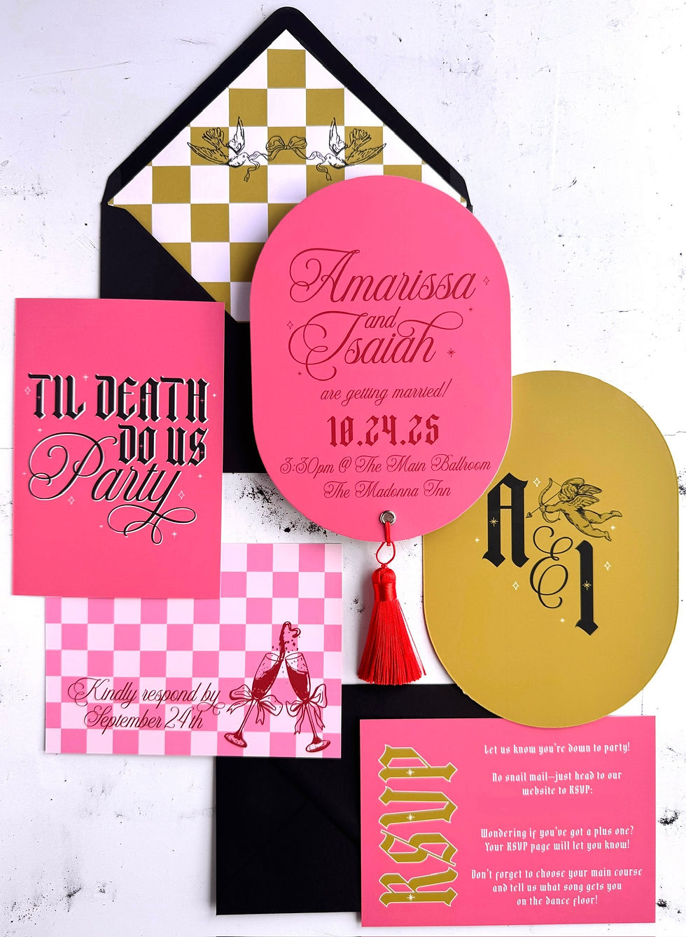
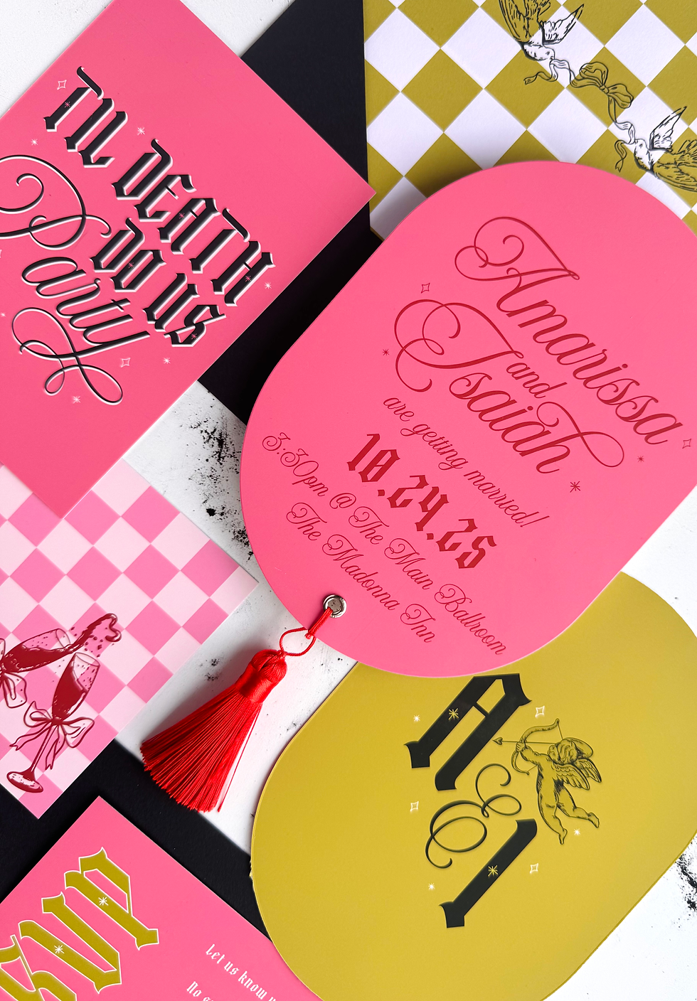
Had the absolute best time designing this punchy, personality-packed wedding suite for my amazing clients Amarissa & Isaiah, who are tying the knot at the iconic and wildly colorful Madonna Inn! 🎉

I am always over the moon when I get a wedding booking at an iconic venue such as the Madonna Inn because I know that the stationery I'll be designing is going to be super cool.
They wanted their invitations to reflect the fun, over-the-top, and slightly offbeat energy of the venue—and we went all in. From the hot pink and mustard color palette, to gothic-meets-script typography, checkerboard patterns, and that bold red tassel (!), every piece of this suite screams LET’S PARTY.
✨ Custom Details:
Personalised monogram complete with cupid
Retro "Til Death Do Us Party" details card
Checkerboard RSVP insert with bubbly glasses illustration 🥂
Envelope liner featuring hand-illustrated doves on a checkerboard backdrop 🕊️

If you're planning a non-traditional wedding and would like your very own fun and off-beat stationery to set the tone for your day then drop me a line via my enquiry form and lets chat!


soicauxsmb.com hôm trước mình lướt thấy ai đó nhắc nên tiện tay vào coi thử cho biết, kiểu tò mò giao diện thôi. Vào cái là thấy trang làm khá “dễ thở”, không nhồi nhét quá nhiều thứ một lúc nên nhìn đỡ mệt mắt. Mình để ý họ chia nội dung theo từng khối rõ ràng, kéo xuống là biết mình đang ở đoạn nào chứ không bị lẫn lộn. Cái mình thích nữa là menu đặt khá lộ, bấm qua lại nhanh, không phải mò hay quay lại nhiều lần. Nói chung cảm giác dùng kiểu nhẹ nhàng, xem lướt cũng nắm được bố cục. Nhìn tổng thể thì phần trình bày dạng khối và cột trên trang…
https://siempreeslunes.com/ mình thấy mọi người bàn tán nên ghé thử cho biết, kiểu vào xem giao diện ra sao thôi. Lướt vài phút là thấy họ làm trang khá “gọn mắt”, phần giới thiệu nền tảng đặt rõ ràng nên không phải đoán đang đọc cái gì. Có nhắc qua chuyện hệ sinh thái trò chơi phong phú với trải nghiệm hiện đại, đọc nhanh vẫn nắm được ý chứ không bị nhồi chữ. Mình xem bằng điện thoại thì ổn, chữ không quá bé và mấy khối nội dung không bị dồn cục hay lệch hàng. Nói chung cảm giác kéo xuống khá mượt, không bị rối. Mình thích nhất là các heading kiểu “cổng game chính thức” được…
https://soicau247.com/soi-cau-7777-soi-cau-chuan-nhat.html hôm bữa thấy mọi người nhắc “soi cầu 7777” nên mình bấm vào coi thử cho biết. Mình không kiểu ngồi đọc hết đâu, chủ yếu lướt nhanh xem trang trình bày ra sao thôi. Ấn tượng là họ chia nội dung theo từng khối nhìn khá thoáng, kéo xuống không bị rối. Có đoạn nhắc lại kết quả XSMB kỳ quay trước nên mình liếc cái là hiểu họ đang dựa trên dữ liệu cũ để nói tiếp phần hôm nay. Mấy tiêu đề/đầu mục để rõ ràng, kiểu nhìn phát biết đang ở phần nào, không phải mò. Nói chung giao diện dễ chịu, nhất là cách họ để mục lục và các khối nội dung tách…
kèo nhà cái 5 chuẩn dạo này mình thấy bạn bè nhắc hoài nên cũng ghé thử cho biết. Mình không phải kiểu ngồi đọc dài, chủ yếu xem trang sắp xếp có dễ nhìn không thôi. Vào cái là thấy phần kèo bóng đá trực tuyến làm dạng bảng khá trực quan, chia cột rõ ràng nên liếc một cái là nắm được, nhất là có tách cả trận với hiệp 1 nên đỡ phải bấm qua lại. Mình cũng để ý mấy tiêu đề kiểu giải thích “kèo nhà cái là gì” đặt ngay trên đầu, nhìn phát biết chỗ nào dành cho người mới. Lướt trên điện thoại cũng ổn vì chữ không bị dính vào nhau,…