
Pure Dracula romance vibes

Updated: May 6
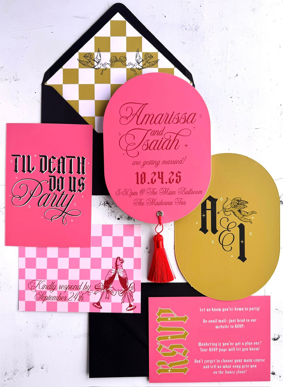
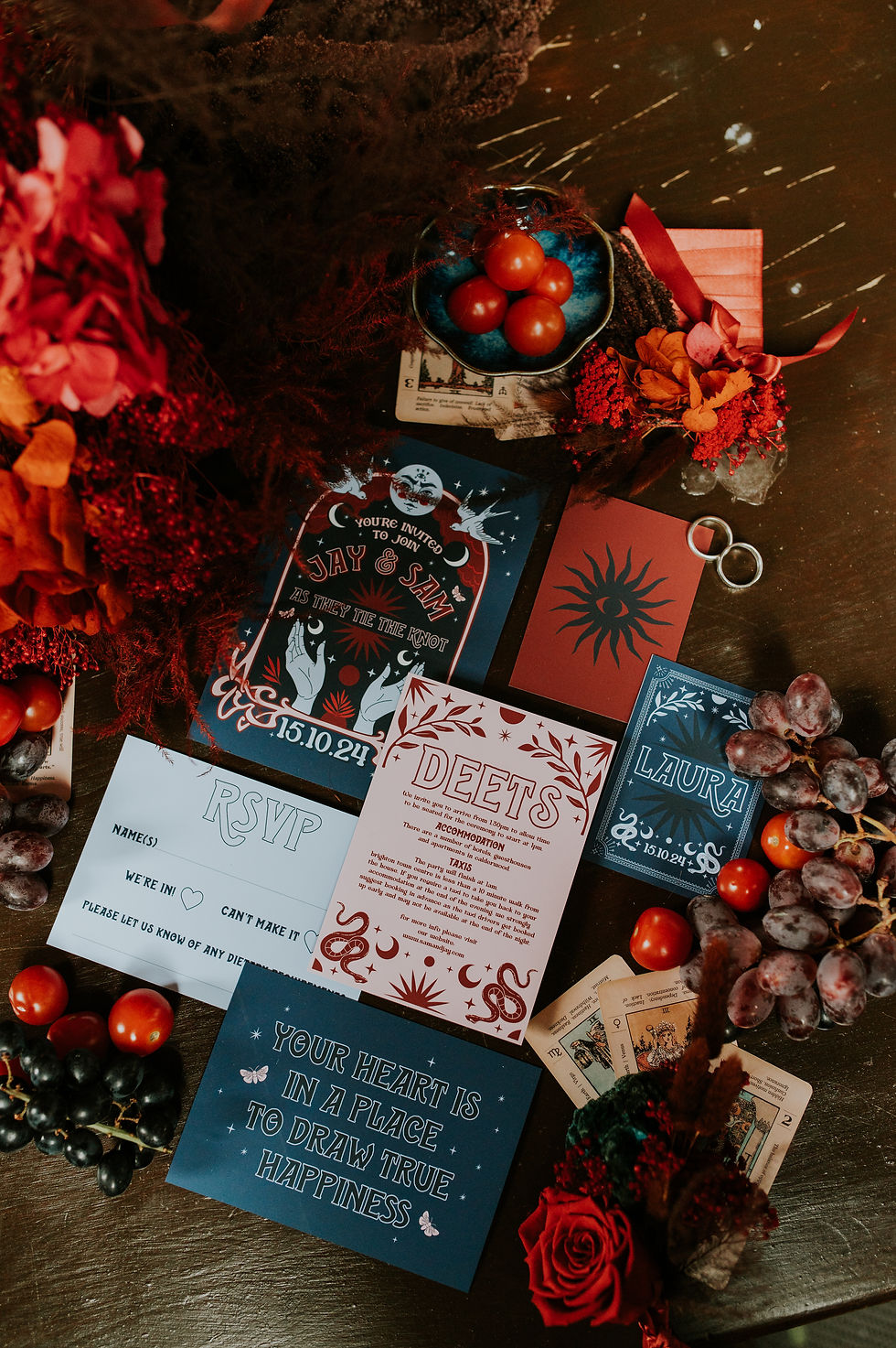
POV....you're invited as a guest to a seriously cool wedding and this is the invitation suite you receive in the post!
Bram Stoker's Dracula is among my all-time favorite films. The line "I have crossed oceans of time to find you" makes it one of the most romantic movies I've ever watched. I drew a great deal of inspiration from the sheer romanticism of this classic love story and infused it into my latest design, fittingly named Mina.
I'm now booking for 2027 & 2028 weddings and space is limited so get in touch if you'd like to create some awesome stationery together!

This stunning and bold wedding stationery suite includes a 5x7 invitation card, a printed envelope with a matching liner, a diamond-shaped details card, an A6 RSVP card with a coordinating envelope. It also features a matching menu card and individually personalized antique key place card.
The set is printed on high-quality matte textured gesso.
All wording and colors can be customized to your specifications at no additional cost, while patterns and graphics can be changed for a small extra fee. If you wish to commission a completely custom set for your wedding day, my custom design fee starts at £250.
Get in touch via my enquiry form by filling out a few details about your wedding day and your stationery needs and I'll get back to you with information regarding my availability and pricing.

Create an unforgettable impression for your seriously cool wedding with these unique invitations that will have your guests rushing to mark their calendars!


If you'd like a no obligation quote for your wedding stationery please feel free to get in touch via my enquiry form here!

https://tacobet.com.mx/pt-br/como-funcionam-os-cassinos-online/ lo abrí pensando “ok, otro texto eterno”, pero la verdad está bastante claro y no se siente como puro humo. Me llamó la atención que arranquen con lo del licenciamiento en Brasil y mencionen la Ley 14.790/2023, porque al menos te ubica rápido en qué marco se supone que funciona todo. También se nota que intentan que no te pierdas: no es el típico bloque gigante, sino que va por partes y se lee sin tener que adivinar qué viene después. Arriba queda bien a la vista ese “Comparativo actualizado en septiembre de 2026” y el “ver ranking completo” como gancho, con títulos grandes separando cada bloque.
Chủ đề giải trí kiểu casino với thể thao mình đọc qua thì cũng quen thôi, nhưng cách họ trình bày làm mình dừng lại lâu hơn dự tính; https://x88.lol/ vào phát là thấy chữ nghĩa vừa đủ, tiêu đề to rõ nên lướt một mạch không bị mất phương hướng. Mình không đăng ký hay gì cả, chỉ xem bố cục với các khối nội dung vì hay bị dị ứng mấy trang nhồi chữ (mắt mình chịu không nổi). Điểm mình thích là phần nội dung cuộn xuống vẫn giữ nhịp, kiểu mỗi đoạn là một “mảng” riêng, nhìn cái là hiểu đang ở mục nào. Thử mở bằng điện thoại cho nhanh thì giao diện vẫn ổn,…
https://uu88sh.com/ tối qua lúc nghỉ giải lao mình mở ra lướt thử cho biết, kiểu ngồi nghịch điện thoại vài phút thôi mà cũng để ý được mấy thứ nhỏ nhỏ. Giao diện nhìn khá sáng sủa, cái menu đặt gọn nên chuyển qua lại giữa các mục không phải dò quá lâu, mình bấm qua bấm lại mấy lần mà vẫn nhớ mình đang ở đâu. Mình cũng thích cách họ chia nội dung thành từng khối riêng, kéo xuống thì các cụm thông tin vẫn đi theo một nhịp khá đều (mấy trang khác hay bị lệch bố cục nhìn mệt mắt). Có mấy bảng số liệu/chi tiết trình bày theo cột nên đọc lướt nhanh cũng nắm…
bonoclub.com me metí un rato para ver qué tal y la verdad es que está bastante aterrizado, sin marearte. Lo que más me sirvió fue que en el tema de iniciar sesión no se van directo a “culpa tuya”, sino que te hacen revisar cosas típicas que pasan: por ejemplo, que la contraseña guardada ya no sea la buena o que el navegador se quede con una sesión rara. Eso lo he sufrido mil veces y acá lo dicen tal cual, sin drama. También se nota un toque de “hazlo seguro” pero sin sermón, más como recordatorio rápido. En general se lee fácil porque no es un muro de texto, está todo en pedacitos cortos y con títulos bien al…
This page felt super easy to read right away—no walls of text, just quick bits that don’t make your eyes glaze over. I was mostly skimming, then I ended up trying **Drift Boss** for a minute and immediately got why people get hooked: it’s that one-button thing where you think it’s chill until your timing’s off and you slide right off the edge. What I liked is it doesn’t drown you in explanations or pop-ups, so you can just mess around and learn as you go. The headings are obvious, and the “How to Play” section is set up like a clean little block that’s hard to miss.